Why your hometown sign is green and not some other color
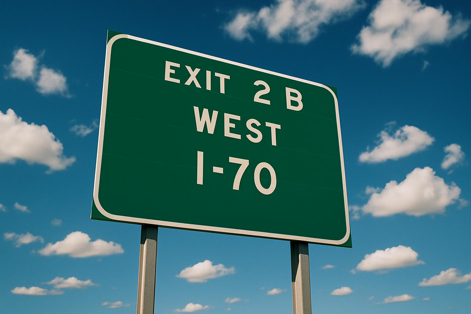
Green means "you are not in trouble."
That's the actual logic. American road signs run on a color code set by the Federal Highway Administration, and every color is a category. Red is prohibition. Stop, yield, wrong way, do not enter. Yellow is warning. Curve ahead, deer, bridge ices before road. Orange means somebody's working out there and the rules just changed on you.
Green is guidance. Directions, distances, destinations, and the sign that tells you what town you just drove into. The federal manual puts it in about as few words as it puts anything: guide signs get a white message and border on a green background.
Nobody in your town picked it
This is the part people are usually surprised by. Your city limit sign wasn't designed by anyone in your city.
The color, the border, the typeface, the reflectivity, the height off the ground, and how far back from the pavement it sits are all specified in the Manual on Uniform Traffic Control Devices. Every state either adopts the federal manual or runs its own version that has to be substantially the same. That's why a green sign in rural Idaho looks like a green sign in coastal Georgia.
Some states allow a town logo alongside the name. That's about the whole range of local expression available.
Uniformity is the entire point
It sounds joyless when you spell it out. Federal manual, standardized color, part numbers instead of place names.
But the reason it works that way is worth respecting. You can drive from one end of this country to the other, through places you have never been and will never see again, at seventy miles an hour, in the dark, in weather, and read every sign correctly without thinking about it once. Green registers before you've consciously read a word of it. That's not an accident. Somebody engineered that.
The tradeoff is that the most emotionally loaded object in a lot of people's memories, the green rectangle that meant you were almost home, is technically a category of federal signage rather than anything your town chose.
Both of those things are true at the same time. It's a standardized guide sign, and it's your hometown.
The color did the heavy lifting
Ask somebody to picture the sign at the edge of the town they grew up in. Nobody says "white lettering, series E typeface." They say green.
The color is doing almost all of the work. It's why a shirt with a green rectangle on it reads as hometown to somebody standing across a parking lot who cannot make out the name yet.
Whether that's Burlington, Wisconsin or somewhere with four hundred people and one blinking light, it's the same green. That was the whole idea.