The federal government banned a font, and Congress un-banned it
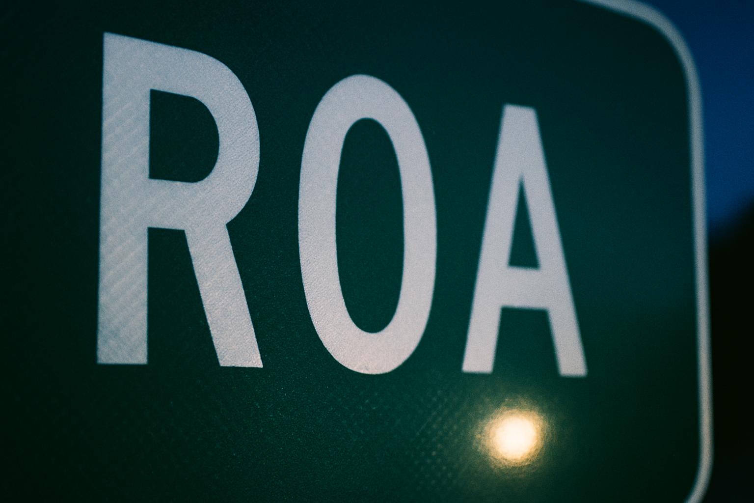
In 2016 the Federal Highway Administration outlawed a typeface. Two years later Congress passed a law putting it back. The agency complied, and then added a sentence making very clear it was not happy about it.
This is a real fight that happened over the lettering on the signs you drive past every day, and almost nobody outside the traffic engineering world noticed.
The old lettering has a name
Every road sign in America was lettered for decades in a typeface officially called the FHWA Series, known to everybody else as Highway Gothic. It's the slightly squarish, no-nonsense alphabet on the green sign at the edge of your town. It was designed for a world of lower speeds and dimmer headlights, and it did its job for half a century.
The complaint that eventually came for it was about halation. At night, retroreflective sign material throws light back at you, and bright white letters can bloom and smear, especially for older eyes. Letters with tight interior spaces suffer worst. A lowercase "e" turns into a glowing blob.
Clearview was the fix
Clearview was drawn to solve exactly that. More open letterforms, taller lowercase, more breathing room inside the characters. The pitch was that it stayed legible at distance and at night without making signs bigger.
The FHWA granted it interim approval on September 2, 2004. States started using it. If you've driven through a state that adopted it, you've read thousands of Clearview signs without consciously noticing anything.
Then FHWA pulled the plug
On January 25, 2016, the FHWA terminated that interim approval.
The reasoning came down to the research not holding up the way everyone hoped. The early legibility gains looked less convincing under broader testing, and Clearview had a specific problem: it was only ever designed for light-on-dark legends. On dark-on-light signs it performed no better than what it replaced, and states were using it in places it was never meant to go.
There was also the matter of it being a licensed commercial typeface, where Highway Gothic was free.
So the ban landed, and states that had spent a decade converting were told to stop.
Congress overruled it
Here is where it stops being a normal engineering story.
Clearview had supporters, and they did not go to the FHWA. They went to Capitol Hill. A reinstatement provision ended up inside Division L, Section 125 of the Consolidated Appropriations Act 2018, the omnibus spending bill.
On March 28, 2018, the FHWA reinstated the interim approval. Not because new research had changed anybody's mind at the agency, but because a spending bill told them to.
And then the FHWA wrote this into the reinstatement notice:
Notwithstanding the reinstatement of this Interim Approval, FHWA makes no recommendation or endorsement of the Clearview letter style.
Read that again. It's a federal agency saying, in the same document where it un-bans something, that it would like the record to show this was not its idea.
What that means for the sign outside your town
Practically, it means the country is lettered in a patchwork. Some states went all in on Clearview, some never touched it, some converted partway and stopped in 2016 and never resumed. The typeface on your hometown sign depends on which state you're in and which budget year the sign happened to get replaced.
Two towns twenty miles apart on opposite sides of a state line can have signs set in different alphabets, for reasons that trace back to a lobbying fight and an omnibus spending bill.
Nobody driving past has ever noticed. That's arguably the highest compliment you can pay either typeface.
The part worth sitting with
It is easy to read all of this as bureaucratic farce, and some of it is. But underneath the memos there was a real question that somebody had to answer: can an older driver read this sign, at night, in the rain, in time to make the turn.
That is not a small question. The answer got argued about for fourteen years, went to Congress, and came back with a shrug and a disclaimer.
Meanwhile the sign at the edge of Beloit, Wisconsin or wherever you grew up just kept standing there, doing the one job it has, in whichever alphabet it happened to be born with.